User Guide
Kick-start your work by creating your Office document based on the latest and most up-to-date templates served to you in your favorite Office application on any device or platform.


The 'Designer' runs within the following Microsoft 365 applications on Windows, Mac, iPad and Office Online:


Please note: The 'Designer' Apps might offer different features depending on the different Microsoft 365 applications on the various platforms.
The 'Designer' supports the following user accounts:

Once the 'Designer' Add-In has been deployed and assigned to you, it will automatically appear in the 'Design' tab of your Office application ribbon. To launch the App best click on the 'Design' button.
Please note:
The 'Designer' Add-In is currently available in Word for Windows, Word for the Web, Word for Mac, and Word for iOS. It is also available in PowerPoint for Windows, PowerPoint for the Browser and PowerPoint for Mac.
Please note:
If the 'Designer' Add-In does not appear, make sure that you have signed-in to Word with your Microsoft 365 Work or School account. If that is the case and the Add-In is still not appearing, then please contact your internal IT department.
To get started with this Add-In/App you need to connect it with your existing Microsoft 365 Work or School account or with your Personal Microsoft Account. Follow these steps:
Please note:
If your Office application supports SSO (Single sign-on) you will not see this welcome screen and be directly signed in to the officeatwork Add-in/App with the same account you signed into your Office application.
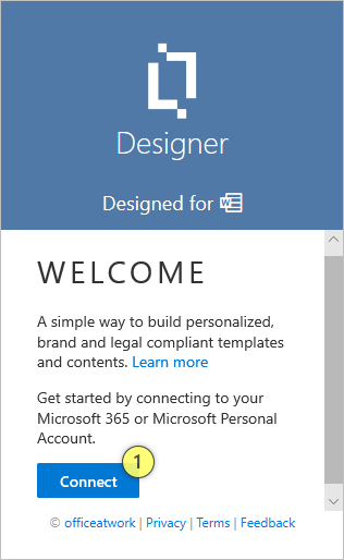
Click on the 'Connect' (1) button.
Sign-in using your Microsoft 365 (Work or School) account or your Personal Microsoft Account.
You might be asked to consent to the Add-In accessing your data. This step might have been taken care of by your internal IT department in advance. In that case you will not be asked.
Done.
Please note:
The actual sign in experience is provided by Microsoft. officeatwork does not offer any user accounts. Users must use their existing accounts to sign in to the Add-In.
Please note:
For Office application versions that do not support automatic SSO (Single sign-on), users will have to repeat this sign-in step periodically, dependent on their Azure AD settings. Usually, this Azure AD setting is set to 90 days. This setting can be changed by each customer individually in Azure AD.
This Add-In accepts Microsoft 365 Work or School accounts. It also accepts Personal Microsoft Accounts including GitHub accounts.
The first time you connect the app, you might be asked to consent to the permissions required by the app. Please go through those permissions carefully and grant consent as the App requires these permissions to function. If you do not grant consent, the app will not work for you.
Please note:
Your IT administrator can pre-consent on behalf of all users. That way you and your fellow users would not have to consent each individually. Your IT administrators can learn more about pre-consenting here.
You can find the app menus at the bottom of the app. It currently consists of the 'officeatwork' logo (on the left) and (on the right) the 'Settings' menu, the 'Help' menu, and the 'User' menu. Clicking on the officeatwork logo will take you to the officeatwork website.
Please note:
Dependent on the officeatwork app and its configuration for your Microsoft 365 tenant, items available in the app menus may vary.
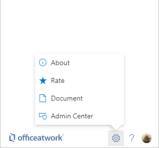
About: This will take you to the about pane that lists various information about this app.
Rate: This will take you to the review page on Microsoft AppSource.
Document: This will take you to the document settings page of this app.
Admin Center: If you are an officeatwork admin, you will see the 'Admin Center' option that will take you straight to the officeatwork 'Admin Center' app.
The help menu is customizable via the officeatwork 'Admin Center' App. The description below explains the standard officeatwork experience. It's also possible that the help option is completely missing (No help experience) or is showing different elements in the case where your officeatwork admin has chosen to go for a custom help experience.
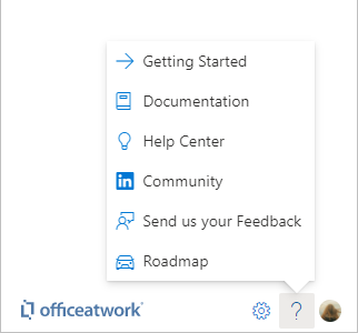
officeatwork standard help experience
Getting Started: Link to a page that will help you get started with this Add-In or App.
Documentation: Link to the documentation of the Add-In or App.
Help Center: Link to the officeatwork Help Center.
Community: Link to the officeatwork community on LinkedIn.
Send us your Feedback: Link to an online feedback form you can use to reach out to officeatwork.
Roadmap: Link to the roadmap page of the Add-In or App.
Additionally to the help experiences listed above, you might also want to consider the following (free and paid) options:
Learn more links: Throughout the app, you will find 'Learn more' links that will take you to the documentation pages covering the topic you are currently viewing. These links are the fastest way to pull up the relevant documentation.
Premium Support: Customers with a Premium Support Subscription can use additional support offerings and channels made available via the premium support subscription.
Your internal resources: You will most likely have internal resources covering the Business aspects or IT aspects of this App. Please also consider reaching out to them when appropriate. Thank you.
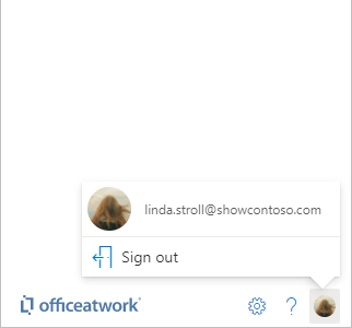
Signed-in User: You can see the photo, name, and email address of the currently signed-in user at the top of the User menu.
Sign out: This option will allow you to sign out of this Add-In/App.
The navigation within the App has one main element, the «Tabs» (1) menu. The «Preview» button in the ribbon opens the «Wizard» in a separate pane. The «Wizard» is also available as a separate App for users that just want to use but not create designs.
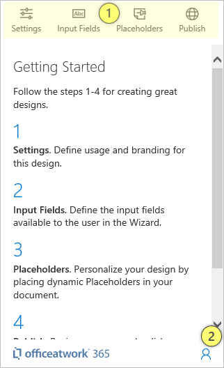
The «Tabs» (1) allows you to select one of the main App sections that are «Settings», «Input Fields», «Placeholders» and «Publish».
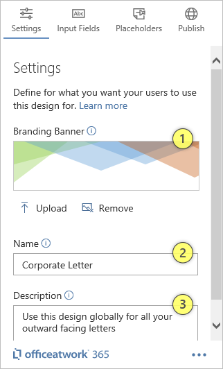
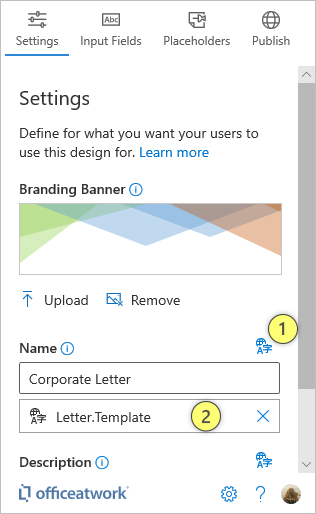
The Settings are the place where you define Branding Banner, Name and a Description for your Template. We highly recommend to use all available settings to optimize the user experience of your document.
The Branding Banner (1) will allow you to have an image placed right at the top of the «Wizard» Add-In. We highly recommend to place some branding element like your logo on the «Wizard» using this Branding Banner option. If you want to align your artwork with the design of the wizard you should know that all elements in the «Wizard» Add-In have a left margin of 18 pixels. So, to accommodate for that just add 18 pixels to the left of your logo and it will align perfectly. While you are at it you might also want to add 10 pixels at the top so that it does not stick to the top of the «Wizard» Add-In.
To upload an image file just click on the «Upload» icon below the image filed and then select a file from your available storage locations using the ‘Choose file to upload’ dialog. Supported file formats are .png, .gif and .bmp.
To remove the banner just click on the «Remove» icon below the image field.

The dimension of your branding banner is largely defined by the kind of logo or artwork you want to display. There are some measurements that you might want to consider. As the default width of the pane is just over 300 pixels we recommend not to exceed 300 pixels in your image (in total). To align it on the left we would suggest to include 18 empty (transparent) pixels on the left and 10 pixels on the top to make it nicely fit into add-in pane. In this ‘officeatwork’ sample we colored in these top and left pixels for better illustration.
The Name (2) is displayed in the «Wizard» Add-In and should be not to long as it is displayed in a larger font. Best use something equivalent as 'Letter' for a Letter document or 'Report' for a Report document.
Please note:
In case you are storing your template files in SharePoint online, the Wizard will display the value coming from the 'Title' SharePoint column instead of your input in the 'Name' field. This is to provide a consistent user experience when users pick the template using the Template Chooser, as it will display the value of the 'Title' column (if it contains a value) as the name of the template. So showing the 'Title' column value also in the Wizard will provide a consistent user experiance.
The Description (3) field is displayed below the Name field in the «Wizard» Add-In and should be no longer than a short sentence describing to users, what this document shall be used for. Best use something equivalent as ‘Use this Letter globally for all your external facing correspondence’.
Please note:
In case you are storing your template files in SharePoint online, the Wizard will display the value coming from the 'officeatwork_description' SharePoint column instead of your input in the 'Description' field.
The Languages field can be used to offer the user of this template a choice of document languages. As soon as you define more than two languages the user will be prompted when using the Wizard to choose a language. Use language codes separated by a coma to define the languages. Sample:
de, en, fr
de-de, de-ch, de-at, en-us, en-uk
Please note:
In case you are storing your template files in SharePoint online, the Wizard will display the value coming from the 'officeatwork_languages' SharePoint column instead of your input in the 'Languages' field.
Please note:
Even if you only support one language in your templates we still recommend noting that language in the Languages field. This will improve the Smart Templates experience considerably.
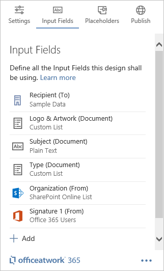
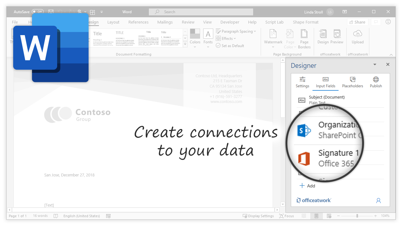
The 'Input Fields' page lists all existing input fields for your active document. Use input fields to allow users to input data that can then be used in document 'Placeholders' to personalize the document purpose fit for the user’s needs, for example for selecting a Brand, a contact person or entering a subject line. Even things like switching between a color and black & white logo for the company brand can be accomplished by utilizing «Input Fields».
To create a new «Input Field» just click on the «Plus» icon at the bottom of your lists of input fields. Then just click on the type of input field you wish to create.
To edit an existing «Input Field» just click on the input field you want to edit in the list of input fields.
To delete an existing «Input Field» just click on the input field you want to delete. Then click on the 'Delete' button at the far bottom left of the input field edit page. You might have to scroll down to access the 'Delete' button.
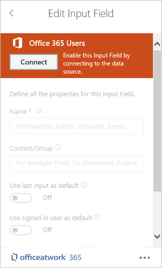
Some fields like the 'Office 365 Users' or 'SharePoint Online List' input field are connected to an external data source. Sources you have not recently used will present a 'Connect' button enabling you to allow the 'Designer' Add-In to connect to the corresponding data source. In this case you first need to click the 'Connect' button and go through an authentication flow to be able to edit the properties for that input field.
The 'Office 365 User' input field will enable you to let the user select a one or many users in the 'Wizard' Add-In. The list of users comes from the Microsoft Graph and represents the users registered in your tenants Azure AD. A typical use for the 'Office 365 User' input field would be to select an author, contact or signature person, or meeting participants for your document. The following user properties are currently available:
displayName
givenName
surname
userPrincipalName
Learn more about the individual properties in the official Microsoft documentation covering the Microsoft Graph: https://docs.microsoft.com/en-us/graph/api/resources/user?view=graph-rest-1.0#properties
Please note: There are more attributes available than the five listed above - but for that you need to enable the all user properties switch. Read more about this below.
The Name of the input field will be visible to the User in the 'Wizard' Add-In. Please try to choose a short and meaningful name that can be easily recognized by your users.
The Group will be visible to the User above the Name field in the 'Wizard' Add-In. The user can collapse and expand groups in the 'Wizard' Add-In using the collapse/expand icon to the left of the group name. Try to pick logical group names that can be shared among multiple input fields providing the user with a logical understanding of all your input fields. Group names could be something like From, To, Document, etc.
If set to 'On' the Add-In will remember the user’s last input/selection and automatically apply the user’s last input/selection for that input field the next time the 'Wizard' Add-In runs the first time for each specific document. This will only work for input fields that have the same 'Name', 'Context/Group', and are of the same type, and have set the same attributes.
Enable this option to allow users to select multiple users for your 'Input Field'. This would for instance make sense when wanting to select multiple meeting participants (any number of users) in just one input field. That way you can avoid having to create separate input fields per participant (like an input field for Participant 1, Participant 2, Participant 3 etc.)
Please note: When inserting user properties of 'multi selection enabled' Office 365 User input fields into a placeholder, the placeholder formula snippet inserted will be adjusted accordingly so that the properties of all selected users will be visible in your document/template.
Enable this option to automatically populate the 'Input Field' with the currently signed-in user.
Please note: The 'Use last input as default' will override any 'Use signed-in user as default' setting. So if there is a last input value available then that value will win over the signed-in user value.
If you want to use additional user properties (see list below) in your documents and templates you need to grant the add-in dedicated permissions to do that. Use the 'Grant Permissions' link to do that. Please be aware that for this to work you need to be a Microsoft 365 admin to be able to grant this access. Here is the list of the additional user properties that will be enabled:
aboutMe
birthday
businessPhones
city
companyName
country
department
employeeId
hireDate
id
imAddresses
interests
jobTitle
mailNickname
mobilePhone
mySite
officeLocation
onPremisesDistinguishedName
onPremisesDomainName
onPremisesExtensionAttributes (extensionAttribute1 - 15)
onPremisesImmutableId
onPremisesUserPrincipalName
otherMails
pastProjects
postalCode
preferredDataLocation
preferredLanguage
preferredName
responsibilities
schools
skills
state
streetAddress
usageLocation
userType
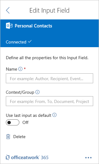
The 'Personal Contacts' input field allows you to let the user select personal contact in the 'Wizard' Add-In. The list of contacts comes from Office 365 Outlook and represents the users contacts in Outlook. Please note that 'Personal Contacts' does not support Outlook Shared Contact Folders.
A typical use for the 'Personal Contacts' would be to select a recipient for your document. The following contact properties are currently available:
assistantName
birthday
businessAddress - city
businessAddress - countryOrRegion
businessAddress - postalCode
businessAddress - state
businessAddress - street
businessHomePage
businessPhone
businessPhone 2
categories
children
companyName
department
displayName
emailAddress - address
emailAddress - name
emailAddress 2 - address
emailAddress 2 - name
emailAddress 3 - address
emailAddress 3 - name
fileAs
flag
generation
givenName
homeAddress - city
homeAddress - countryOrRegion
homeAddress - postalCode
homeAddress - state
homeAddress - street
homePhone
homePhone 2
id
imAddresses
initials
jobTitle
manager
middleName
mobilePhone
nickName
officeLocation
otherAddress - city
otherAddress - countryOrRegion
otherAddress - postalCode
otherAddress - state
otherAddress - street
parentFolderId
personalNotes
profession
spouseName
surname
title
The Name of the input field will be visible to the User in the 'Wizard' Add-In. Please try to choose a short and meaningful name that can be easily recognized by your users.
The Group will be visible to the User above the Name field in the 'Wizard' Add-In. The user can collapse and expand groups in the 'Wizard' Add-In using the collapse/expand icon to the left of the group name. Try to pick logical group names that can be shared among multiple input fields providing the user with a logical understanding of all your input fields. Group names could be something like From, To, Document, etc.
If set to 'On' the Add-In will remember the user’s last input/selection and automatically apply the user’s last input/selection for that input field the next time the 'Wizard' Add-In runs the first time for each specific document. This will only work for input fields that have the same 'Name', 'Context/Group', and are of the same type, and have set the same attributes.
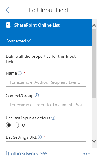
A SharePoint Online List Picker will allow you to select and display data from any SharePoint Online List including images from SharePoint document libraries in your documents. Please note that only the following column types are currently supported:
Date and Time
Single line of text
Multiple lines of text (plain text and simple rich text)
Choice (menu to choose from)
Number (1, 1.0, 100)
Currency ($, ¥, €)
Hyperlink or Picture
Calculated
Image
The Name of the input field will be visible to the User in the 'Wizard' Add-In. Please try to choose a short and meaningful name that can be easily recognized by your users.
The Group will be visible to the User above the Name field in the 'Wizard' Add-In. The user can collapse and expand groups in the 'Wizard' Add-In using the collapse/expand icon to the left of the group name. Try to pick logical group names that can be shared among multiple input fields providing the user with a logical understanding of all your input fields. Group names could be something like From, To, Document, etc.
If set to 'On' the Add-In will remember the user’s last input/selection and automatically apply the user’s last input/selection for that input field the next time the 'Wizard' Add-In runs the first time for each specific document. This will only work for input fields that have the same 'Name', 'Context/Group', and are of the same type, and have set the same attributes.
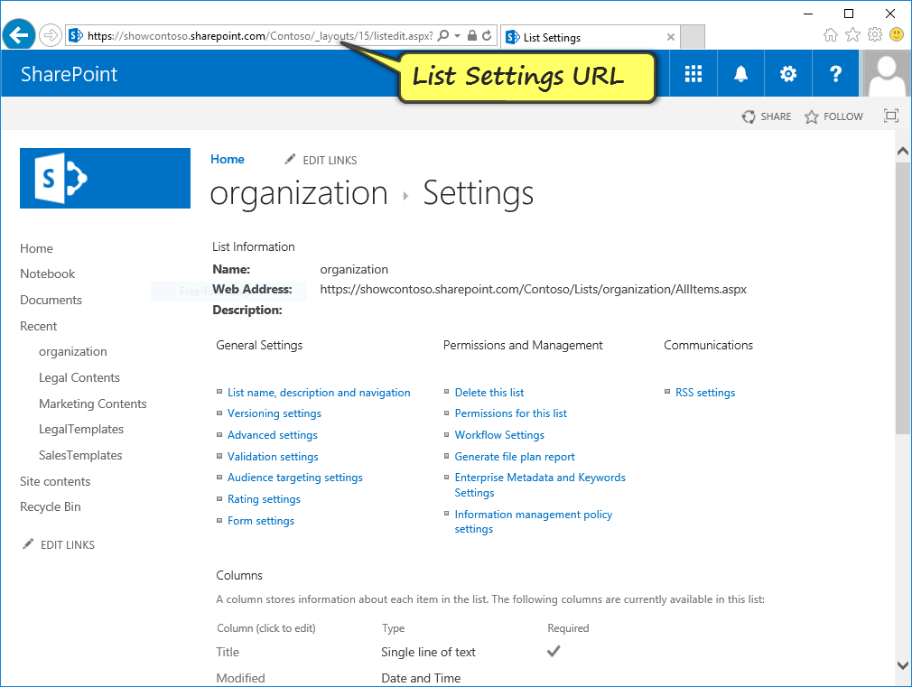
The List Settings URL is used to identify the SharePoint list. It is easiest to copy and paste the List Settings URL from your browser when viewing the list settings page of your SharePoint list in your browser. After you have exited the field the Add-in will check if it can access the library referenced in the URL. If successful it will enable and populate the Search Field and Description Field below with values. Please be aware that the URL must be within your SharePoint Online root host.
Please note: The user will need at least read rights to the root site of the site collection you are connecting to.
The 'Title Field' is the field used in the 'Wizard' Add-In to display any items found in the search experience for the linked SharePoint list. Most commonly this would be the ‘Title’ field from your SharePoint Online list.
Please note:
Only ‘Single line of text’ is currently supported for the title field.
The 'Description' field is used in the 'Wizard' Add-In to display any items found in the search experience for the linked SharePoint list. The 'Description' field appears less prominent below the Title field within the search experience.
Please note:
Only the following column types are supported for the description field:
Single line of text
Multiple lines of text
Calculated
The 'Title' and 'Description' fields are being used for searching the entries in SharePoint Online. Be aware that this search occurs also in the translated columns of those fields. If you, for instance, define the SharePoint column 'Title' to be you Title field, the app will search in the 'Title' column as well as in the appropriate Title.[language code] (for example Title.en, Title.de etc.) columns according to your app frontend language.
Attention:
Please be aware that lists with more than 5000 items will not be searchable unless you index the fields in SharePoint that will be used for searching. Please also be aware that the search will only search in the defined Title column. Title translation fields as well as the description field (including description translation fields) will be ignored.
The ‘Default Value’ option will allow you to select a specific Item (record) from your SharePoint list selected by default. For this to work you need to specify some criteria that will find a record in the SharePoint Online list. The criteria is defined by a field using the «Field» dropdown, an operator using the «Operator» dropdown and a value entered in the «Value» field. Note that the value can be made up of static input as well as formulas using Nunjucks functions. To add a function just click on the «Insert» button below the Value field.
The first item is found in the SharePoint list that will return true when comparing field with the value using the chosen operator. Example: select the first SharePoint record where the SharePoint column ‘City’ («Field») ‘Starts with’ («Operator») ‘London’ («Value»).
If you for instance want to select a record in SharePoint based on the City of the current user the example would look like this: select the first SharePoint record where the SharePoint column ‘City’ («Field») ‘Starts with’ («Operator») {{ currentUser.city }} («Value»)
Please note: The 'Use last input as default' will override any 'Default' setting. So if there is a last input value available then that value will win over the signed-in user value.
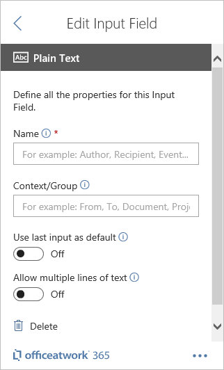
Use this 'Plain Text' input field type whenever you want the user to be able to input some text of any kind without any guidance. This input field type has no additional properties.
The Name of the input field will be visible to the User in the 'Wizard' Add-In. Please try to choose a short and meaningful name that can be easily recognized by your users.
The Group will be visible to the User above the Name field in the 'Wizard' Add-In. The user can collapse and expand groups in the 'Wizard' Add-In using the collapse/expand icon to the left of the group name. Try to pick logical group names that can be shared among multiple input fields providing the user with a logical understanding of all your input fields. Group names could be something like From, To, Document, etc.
If set to 'On' the Add-In will remember the user’s last input/selection and automatically apply the user’s last input/selection for that input field the next time the 'Wizard' Add-In runs the first time for each specific document. This will only work for input fields that have the same 'Name', 'Context/Group', and are of the same type, and have set the same attributes.
If set to «On» the Plain Text Input field in the «Wizard» Add-In will offer the user multiple lines for entering data instead of just one line.
Please note: If you are inserting a multi lines enabled text field into a HTML placeholder you should use the 'nl2br' Nunjucks filter in your field formula to convert the carriage return a user might make to HTML actionable <br> elements.
The 'Custom External List' input field allows you to let the user pick between one or many entries of any data you can connect via a Flow, Logic App, Azure Function or any other web service. A typical use for the 'Custom External List' would be to connect to data from other applications.
The Name of the input field will be visible to the User in the 'Wizard' Add-In. Please try to choose a short and meaningful name that can be easily recognized by your users.
The Group will be visible to the User above the Name field in the 'Wizard' Add-In. The user can collapse and expand groups in the 'Wizard' Add-In using the collapse/expand icon to the left of the group name. Try to pick logical group names that can be shared among multiple input fields providing the user with a logical understanding of all your input fields. Group names could be something like From, To, Document, etc.
If set to 'On' the Add-In will remember the user’s last input/selection and automatically apply the user’s last input/selection for that input field the next time the 'Wizard' Add-In runs the first time for each specific document. This will only work for input fields that have the same 'Name', 'Context/Group', and are of the same type, and have set the same attributes.
Enable this option to allow users to select multiple users for your 'Input Field'. This would for instance make sense when wanting to select multiple meeting participants (any number of users) in just one input field. That way you can avoid having to create separate input fields per participant (like an input field for Participant 1, Participant 2, Participant 3 etc.)
Please note: When inserting user properties of 'multi selection enabled' Office 365 User input fields into a placeholder, the placeholder formula snippet inserted will be adjusted accordingly so that the properties of all selected users will be visible in your document/template.
Represents the URL of the HTTP service. Please make sure your HTTP service complies with the following:
The service needs to accept a JSON payload in the body of the request that matches this schema as a POST request.
Only HTTPS is allowed.
The service must be CORS enabled.
Field names are case sensitive.
Make sure to include an ID field that can be used to identify the selected record. This ID field will also be used in combination with 'Use last selection'.
Fields you define must be characters or numbers only. No special characters allowed - for example, no space character.
The 'Identifier Field' is the field used to identify a specific record and is submitted to the HTTP endpoint.
The 'Title Field' is the field used in the 'Wizard' Add-In to display any items found in the search experience. Most commonly this would be the name of a person, company etc.
The 'Description' field is used in the 'Wizard' Add-In to display any items found in the search experience. The 'Description' field appears less prominent below the Title field within the search experience.
If the HTTP service supports bearer token authentication, then you can include the Client ID which will allow the Template Chooser to obtain a bearer token that then gets passed along with the HTTP request allowing the HTTP service to verify the call.
Whatever is entered/evaluated for the default value field will be made available during the 'default' cycle in the connected web app. This way the web app can deliver a bespoke default value experience for the users. The value of the field will be evaluated before passing on to the web app. The field supports various Nunjucks formulas and constants.
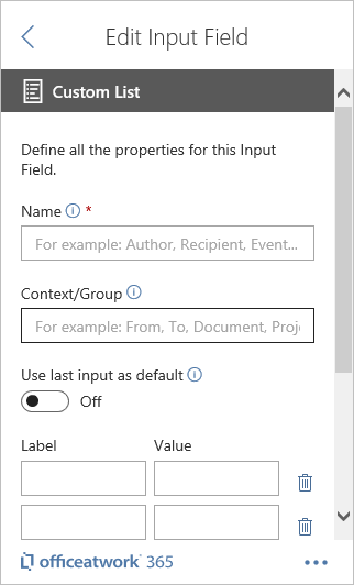
The 'Custom List' input field allows you to let the user make a choice between pre-defined options in the 'Wizard' Add-in. A typical use for the 'Custom List' would be to control if the company logo shall appear in color or black & white.
The Name of the input field will be visible to the User in the 'Wizard' Add-In. Please try to choose a short and meaningful name that can be easily recognized by your users.
The Group will be visible to the User above the Name field in the 'Wizard' Add-In. The user can collapse and expand groups in the 'Wizard' Add-In using the collapse/expand icon to the left of the group name. Try to pick logical group names that can be shared among multiple input fields providing the user with a logical understanding of all your input fields. Group names could be something like From, To, Document, etc.
If set to 'On' the Add-In will remember the user’s last input/selection and automatically apply the user’s last input/selection for that input field the next time the 'Wizard' Add-In runs the first time for each specific document. This will only work for input fields that have the same 'Name', 'Context/Group', and are of the same type, and have set the same attributes.
Each option in a custom list has a «Label» and «Value» entry. The «Label» will be visible to the user as the option he or she can pick. The «Value» will not be visible to the user but can still be used within a calculation of a placeholder value.
To create new entries just press the plus icon at the bottom of the list of all custom list items. To delete an item, click the delete button to the far right of each custom list item. There is no limit in how many items you can have in a custom list. We do though suggest to not go crazy regarding the amount of items per custom list. Preferably a custom list has no more than 7 items.
Once all Custom List items have been created one of the entries can be defined as the default item. This means that this item will automatically be selected as the default value when the Custom List field gets displayed in the «Wizard» Add-in.
The 'Date' input field allows you to let the user to pick a date in the 'Wizard' Add-in. A typical use for the 'Date' would be things like 'document date, 'contract date' etc.
The Name of the input field will be visible to the User in the 'Wizard' Add-In. Please try to choose a short and meaningful name that can be easily recognized by your users.
The Group will be visible to the User above the Name field in the 'Wizard' Add-In. The user can collapse and expand groups in the 'Wizard' Add-In using the collapse/expand icon to the left of the group name. Try to pick logical group names that can be shared among multiple input fields providing the user with a logical understanding of all your input fields. Group names could be something like From, To, Document, etc.
If set to 'On' the Add-In will remember the user’s last input/selection and automatically apply the user’s last input/selection for that input field the next time the 'Wizard' Add-In runs the first time for each specific document. This will only work for input fields that have the same 'Name', 'Context/Group', and are of the same type, and have set the same attributes.
This offers the option 'today' that would insert today's date of when the document was created. For this to work the Wizard Add-in must be run and the document/template would have to be cleared of any data using the publishing function 'Activate Placeholders'.
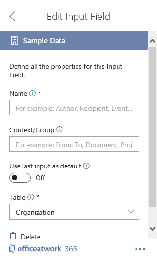
The 'Sample Data' input field offers a fast way to learn how users can select data using the 'Wizard' Add-In without having to first set-up lists and libraries in SharePoint. All our sample files that we offer for the 'Designer' Add-In and 'Wizard' are using input fields of type 'Sample Data'.
The Name of the input field will be visible to the User in the 'Wizard' Add-In. Please try to choose a short and meaningful name that can be easily recognized by your users.
The Group will be visible to the User above the Name field in the 'Wizard' Add-In. The user can collapse and expand groups in the 'Wizard' Add-In using the collapse/expand icon to the left of the group name. Try to pick logical group names that can be shared among multiple input fields providing the user with a logical understanding of all your input fields. Group names could be something like From, To, Document, etc.
If set to 'On' the Add-In will remember the user’s last input/selection and automatically apply the user’s last input/selection for that input field the next time the 'Wizard' Add-In runs the first time for each specific document. This will only work for input fields that have the same 'Name', 'Context/Group', and are of the same type, and have set the same attributes.
The 'Sample Data' input field offers different types of sample data. Use the Table field to select the type of sample data you want to use in your input field.
Here is a list of the available sample data tables:
Users
Contacts
Events
Invoices
Offers
Organizations
The names and descriptions you use in your 'Design Settings' and 'Input Fields' can be translated so that users with different Microsoft 365 or Office/Browser UI languages can experience your Designer/Wizard configuration in their preferred language.
The UI Translations feature is switched off by default. To enable UI Translations you need to activate the feature using the officeatwork Admin Center.
To assign translations just click on the Translations toggle button above your input field and pick any translation available.
Toggle Translation
Click on the 'translation toggle' (1) button.
Please note:
The 'translation toggle' button will only appear once you have configured the UI Translations Library in the Admin Center.
The translation field will show or hide below.
Done.
Pick a translation
Click into the 'Translation field' (2).
A translation picker fly-out will appear.
Search and select your translation entry.
Done.
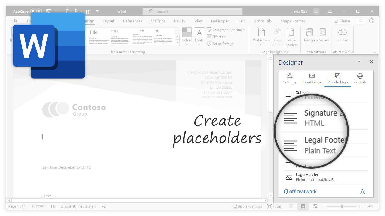
The 'Content Controls' card on the 'Placeholders' page lists all existing content control placeholders for your active document. 'Content Controls' are used to visualize data entered or select via the 'Wizard' Add-in, allowing the user to personalize the document purpose fit for their needs.
To create a new 'Content Control' placeholder just click on the '+ Add' button at top of your lists of 'Content Controls'. A panel will appear allowing you to provide a custom name and pick one or multiple values for your new 'Placeholder'. All of these attributes can be changed later. Still we recommend to fill-in all the fields as desired.
When you click on the '+ Add' button it will create a native Word 'Content Control' as your representation of your 'Placeholder' in the document at the current cursor position. Additionally it will display the properties panel for that newly created 'Placeholder'. Learn more about the individual properties below. To get back to the list of all your 'Placeholders' just click on the back icon '<' in the header of the 'Properties' page.
Please note: Learn more about how to position your placeholder here.
To edit a 'Content Control Placeholder' just click on the 'Content Control' in the list of 'Content Control Placeholders'. Once you are done editing the 'Placeholder', click on back icon '<' at the top left of the page to return to the list of 'Content Control Placeholders'.
To view a 'Content Control Placeholder' in the document hover over a 'Content Control' in the list of 'Content Control Placeholders' and click on the 'Eye' icon. This will bring into view and select the appropriate placeholder representation (Content Control) in your Word document. Additionally it will also mark your 'Content Control' in the list of 'Content Control Placeholders' with a blue bar indicating that this placeholder is currently selected within your Word document. Note that this works independently from pressing the 'Eye' icon. You can select any portion of your Word document and the blue bars will appear for all selected 'Content Control ' in the list of 'Content Control Placeholders'.
To delete a 'Content Control Placeholder' just navigate to the appropriate 'Placeholder' details and use the 'Delete' button at the bottom left of the page or delete the related native Word «Content Control» in your document and reload the add-in or page to see the list of 'Content Control Placeholders' update accordingly.
Once you have clicked on any of the placeholders you will be taken to the properties page of that placeholder. To return to the list of placeholders just click on the arrow back on the 'Edit Placeholder' page.
Use the Name property to give your 'Content Control Placeholder' a meaningful name. The name will only be used within the 'Designer' Add-in and will help you to choose between many 'Placeholders' in your 'Content Control Placeholders' list. This property is optional. If you do not define a name for your 'Placeholder' it will be listed as 'Untitled' in the Placeholders list.
Plain Text: This will transfer all the content from the 'Value' property as plain text into the body section of the native Word 'Content Control'.
HTML: This will transfer all the content from the 'Value' property as HTML into the body section of the native Word 'Content Control'. You will be able to use HTML formatting options like for bold or for header formatting.
Picture from Public URL: This will interpret the content from the 'Value' property as a URL and insert the linked image into the body section of the native Word 'Content Control'. Please make sure that the URL points to a CORS enabled server and that the image is publicly available and not protected with any kind of sign-in. The currently supported file formats are: PNG, JPG and GIF.
Picture from SharePoint Online URL: This will interpret the content from the 'Value' property as a URL and insert the linked image into the body section of the native Word 'Content Control'. Please make sure that the URL is pointing to your SharePoint Online tenant and that the SharePoint Online user rights are set in a way that the designated users have access to that image resource (URL) within your tenant. The currently supported file formats are: PNG, JPG and GIF.
Content from SharePoint Online URL: This will interpret the content from the 'Value' property as a URL and insert the linked content (Word file) into the body section of the native Word 'Content Control'. Please make sure that the URL is pointing to your SharePoint Online tenant and that the SharePoint Online user rights are set in a way that the designated users have access to that resource (URL) within your tenant. The currently supported file formats are: Docx. Currently, only one URL is supported.
Please note: Learn more about how to display images in placeholders here.
The 'Value' property represents the actual value that will be inserted in the defined 'Format' into the body section of the native Word 'Content Control' in the document.
Please note: Learn more about how to customize the value of a placeholder here.
Use the 'Title' property to add a title for your Word 'Content Control' representing your 'Placeholder' in the document. This property is optional.
Please note: The 'Title' of your 'Placeholder' will only be visible in the related native Word 'Content Control' if the 'Show as' property of the 'Placeholder' is set to either 'Start/End Tag' or 'Bounding Box'.
Use the 'Hint' property to define what shall be visible as content of the 'Placeholder' in case the 'Value' of the 'Placeholder' is empty. Use this to hint to the user what values will be visible when data is evaluated as 'Content' for the 'Placeholder'.
Note that by default every placeholder comes with a hint pre-defined. So, if you do not set the 'Hint' property you will be seeing a hint text whenever your placeholder is empty. To show nothing when your placeholder is empty you need to actively set your hint text to nothing. You can do this by setting your hint 'Type' to 'Custom Text' and leaving your hint 'Custom Text' property empty.
Use the 'Deletable' property to define if the user shall be able to delete the 'Placeholder' in the Document. Set this option to 'Cannot be deleted' if you do not want the user to be able to delete this 'Placeholder'.
Use the 'Editable' property to define if the user shall be able to click into the 'Placeholder' in the Document and change the value of it by typing, pasting or deleting the content. Set this option to 'Cannot be edited' if you do not want the user to be able to edit the content of this 'Placeholder'.
Tip: If you cannot format your 'Placeholders' on your document it might be set to be non-editable. Please check the 'Editable' property of your placeholder to make sure it is not set to 'Cannot be edited' when trying to format it.
Use the 'Show as' property to define the appearance of the 'Content Control' in the Document.
The 'Content Control Placeholders' used in the 'Designer' are native Word 'Content Controls'. Word 'Content Controls' can be placed according to the capabilities of Word.
Please note: Content Control Placeholders in shapes and headers and footers might cause issues, be not be modifiable at all, or have restrictions on some platforms (mainly Office online). In general we would advise not to use shapes to place Content Control Placeholders but use tables instead.
Learn more about how to define the 'Value' property so that it display the data the users have selected or entered using the officeatwork 'Wizard' Add-in or when using the simulation of that add in as part of the officeatwork 'Designer' Add-in.
The format option defines in what format the Value will be sent to Word. So if you want Word to insert your Value as a picture you need to select one of the picture formats. If you want it to format is as HTML you need to pick the HTML version. If you want no formatting at all you just choose the Plain Text option.
Use the HTML option if you want to add some formatting to the value your Placeholder will display. Typically, you would add things like bold or heading style markers to display HTML supported formatting in your Placeholder value. This could look as simple as this: ‘my <b>bold<b> text’ producing this outcome: ‘my </b></b>bold text’.
Use the Plain Text format if you want to have your Placeholder to display the value entirely formatted in the way the Placeholder itself is formatted.

Use this option if you want to the value your Placeholder will display as picture. In this case you need to make sure that the value contains a sound URL pointing to an image reachable by an secured (HTTPS) URL.
Please note: The URL must be reachable via HTTPS and must be CORS enabled.
Use this option if you want to the value your Placeholder will display as picture. In this case you need to make sure that the value contains a sound URL pointing to an image within your SharePoint Online tenant as word will display a picture based on that URL. Typically, you would use the value of a hyperlink column in SharePoint to capture that URL. This could look as simple as this: ‘{{ field(‘Organization’, ‘From’).logoHeader }}’ where the value of the logoHeader column in SharePoint contains a URL to an image stored in one of your Document Libraries in your SharePoint Online tenant.
Tip: Learn more about how to insert a picture from SharePoint Online here.
.png (recommended)
.jpg
.gif
.emf / .wmf
Both these formats are not supported in Office for the browser. So if you are looking for your designs to also work in Office for the Browser, you should not use either of these image formats.
.bmp
Please do not use the .bmp image format as images in that format tend to be large. This will then result in lengthy download times often decreasing the user experience substantially.
To display static values just type the text you want to see into the value field.
To calculate Dynamic values, you can use officeatwork specific functions as listed on the Functions page.
Placeholders can be configured so that they show their content in a formatted way. Learn more about how to format your placeholder content using the methods described below.
A simple way to format your placeholder is to use HTML syntax to define the look of your content in your placeholder. This will of course only work if your placeholder format is set to HTML.
A very powerful way to do formatting is to reference an existing Word style (Word paragraph styles only) in your placeholder content. To do that you can use the HTML class attribute.
Sample 1 (custom style)
<p class="mystylename">My Text</p><br>
In this example the class attribute is referencing the style called 'mystylename'. This will then format the 'My Text' using the 'mystylename' Word Style.
Please note: If you use a style name that does not exist, the Designer Add-In will create the style for you.
Please note: Be aware that if you type a new style name slowly, it could happen that the Designer Add-In creates multiple styles while you are typing. So, it might be best to paste the style names in one go to avoid creating unwanted styles!
Please note: If you are referencing an already existing style be aware that the Designer Add-In will only recognize styles in lower caps (Word limitation). So please make sure that any existing custom style you want to reference is in lower caps.
Please note: If you are referencing an already existing built in style make sure you have used it at least once before you use it in your HTML. If the style has not been used in your document before, the style will lose its formatting when used for the first time via your HTML.
Please note: adding a <br> at the end of your HTML is currently necessary due to a bug in Word.
Sample 2 (built-in style)
<p class="msoSubtitle">My Text</p><br>
In this example the class attribute is referencing a built-in Word style called 'Subtitle'. This will then format the 'My Text' using the 'Subtitle' Word Style.
Please note: adding a <br> at the end of your HTML is currently necessary due to a bug in Word.
With the <b></b> tag (b standing for bold or strong) you can for instance have parts of your content appear in bold.
Sample
This is <b>my</b> text
This sample will appear as 'This is my text' in the placeholder in Word.
To learn more about how to use HTML to format your content check out any HTML reference. Be aware that not all HTML options will be supported by Word.
To display an image in your placeholder you must select either 'Picture form public URL' or 'Picture from SharePoint Online URL' as the type of your placeholder content. Additionally, the content value field must contain a URL allowing the Add-in to fetch the referenced image to display it in the placeholder in the document.
Please note:
Currently, only one image is supported per placeholder. Providing 2 or more images in one and the same placeholder will not show any image at all!
A typical scenario for showing images on documents or templates would be a company logo. In most cases, you do not just choose to display an image on a document or template but a set of data including an image. That is why in most cases images would be linked indirectly via a list in SharePoint.
So let’s look at the scenario where you would want to place your company logo onto a document or template:
Create a 'Document Library' in SharePoint for your images.
Upload your images to that «Document Library».
Create a SharePoint 'List' for your company entries.
Add all necessary columns to the 'List' like 'Address', 'City', 'Phone' and of course a column for the logo. That column needs to be of type 'Hyperlink or Picture'.
Now create a record for each of your companies and copy the URL of your logo image you stored in the 'Document Library' into the ‘Hyperlink or Picture’ column you created in your SharePoint 'List'.
Use the 'Designer' Add-in to create an «Input Field» that references your 'List' you just created in SharePoint.
Then use the 'Designer' Add-in to create a 'Placeholder' of type 'Picture from SharePoint Online URL' that references the URL of the 'Hyperlink or Picture' column in your SharePoint 'List'.
Finally, use the 'Preview' button in the 'Designer' Add-in to verify your work.
HTML: This will transfer all the content from the 'Value' property as HTML into the body section of the native Word 'Content Control'. You will be able to use HTML formatting options like for bold or for header formatting.
Picture from Public URL: This will interpret the content from the 'Value' property as a URL and insert the linked image into the body section of the native Word 'Content Control'. Please make sure that the URL points to a CORS enabled server and that the image is publicly available and not protected with any kind of sign-in. The currently supported file formats are: PNG, JPG and GIF.
Picture from SharePoint Online URL: This will interpret the content from the 'Value' property as a URL and insert the linked image into the body section of the native Word 'Content Control'. Please make sure that the URL is pointing to your SharePoint Online tenant and that the SharePoint Online user rights are set in a way that the designated users have access to that image resource (URL) within your tenant. The currently supported file formats are: PNG, JPG and GIF.
The 'Document Properties' card on the 'Placeholders' page lists all existing document property placeholders for your active document. 'Document Properties' are used to set meta data of your document using data entered or select via the 'Wizard' Add-in.
To create a new 'Document Property' placeholder just click on the '+ Add' button at top of your lists of 'Document Properties'. A panel will appear allowing you to choose one of the built-in document properties or to create a new custom name for your new 'Placeholder'.
When you click on the '+ Add' button it will create/update a native Word 'Document Property'. Additionally it will display the properties panel for that newly created 'Placeholder'. Learn more about the individual properties below. To get back to the list of all your 'Placeholders' just click on back icon '<' in the header of the 'Properties' page.
To edit a 'Document Property Placeholder' just click on the 'Document Property' in the list of 'Document Property Placeholders'. Once you are done editing the 'Placeholder', click on back icon '<' at the top left of the page to return to the list of 'Document Property Placeholders'.
To view a 'Document Property Placeholder' you need to navigate in Word to 'File' > 'Info' and click on 'Properties' to select 'Advanced Properties'. This will open the document Properties window for your current word document. Navigate this window to explore the values of your 'Document Properties'.
To delete a 'Document Property Placeholder' just navigate to the appropriate 'Placeholder' details and use the 'Delete' button at the bottom left of the page.
Please note:
Deleting a 'Document Property Placeholder' will not delete the Word Document Property. If you want to clear the Word 'Document Property' value or the property itself you need to do this using Word.
Once you have clicked on any of the placeholders you will be taken to the properties page of that placeholder. To return to the list of placeholders just click on the arrow back on the 'Edit Placeholder' page.
Use the Name property to give your 'Document Property Placeholder' a meaningful name. The name will be used to create the actual Word 'Document Property' (for custom properties only).
Please note:
This 'Name' property is disabled for Word Built-In Document Properties.
The 'Value' property represents the actual value that will be inserted into the native Word 'Document Property'.
Please note:
The 'Value' property will only be evaluated as text, not as HTML.
Learn more about how to define the 'Value' property so that it display the data the users have selected or entered using the officeatwork 'Wizard' Add-in or when using the simulation of that add in as part of the officeatwork 'Designer' Add-in.
To display static values just type the text you want to see into the value field.
To calculate Dynamic values, you can use officeatwork specific functions as listed on the Functions page.
The 'Smart Template' card on the 'Placeholders' page lists all existing smart template placeholders for your active document. 'Smart Template' placeholders are used to allow user to capture content for their Smart Templates.
To create a new 'Smart Template' placeholder just click on the '+ Add' button at top of your list of 'Smart Template'. This will display the properties panel for that newly created 'Placeholder'. Learn more about the individual properties below. To get back to the list of all your 'Placeholders' just click on back icon '<' in the header of the 'Properties' page.
To edit a 'Smart Template Placeholder' just click on the placeholder in the list of 'Smart Template Placeholders'. Once you are done editing the 'Placeholder', click on back icon '<' at the top left of the page to return to the list of 'Smart Template Placeholders'.
To delete a 'Smart Template Placeholder' just navigate to the appropriate 'Placeholder' details and use the 'Delete' button at the bottom left of the page.
Once you have clicked on any of the placeholders you will be taken to the properties page of that placeholder. To return to the list of placeholders just click on the arrow back on the 'Edit Placeholder' page.
Use the ID property to give your 'Smart Template Placeholder' a unique and meaningful ID. The ID will be used to capture the content the user enters for each Smart Template placeholder. Do not rename the ID after it has been used for creating Smart Templates as this would remove the user's content next time the user edits the Smart Template. Also, it is advised to keep your IDs consistent across your base templates. For instance, you would add a Smart Template placeholder with ID 'Body' across many of your base templates.
Please note:
A template that has been enriched with Smart Template Placeholders is regarded as being a Base template.
The Title property will be used as title of the Content Control element linked to the Smart Template Placeholder in the Word document. Provide a meaning full title so that your users understand how to use your Smart Template Placeholders.
To set a custom value you need to choose 'Custom' in the Type dropdown.
To calculate Dynamic values, click on the '+ Insert' button and choose whatever you need from the Insert flyout. Learn more about officeatwork specific functions on this Functions page.
The Hint property will be used as hint of the Content Control element linked to the Smart Template Placeholder in the Word document. Provide a meaning full hint text so that your users understand how to use your Smart Template Placeholders.
To set a custom value you need to choose 'Custom' in the Type dropdown.
To calculate Dynamic values click on the '+ Insert' button and choose whatever you need from the Insert flyout. Learn more about officeatwork specific functions on this Functions page.
To calculate Dynamic values, you can use officeatwork specific functions as listed below as well as the functions described on the Nunjucks documentation pages. Each function must be encapsulated by two curly brackets on either side {{ function() }}. Please note that when you are using block functions like If() or Case() with curly bracket and percentage character {% … %} that functions within need only one set of curly brackets {% { function() } %}. Please also note that when nesting functions that {{ function(function()) }} that only the most outer function needs curly brackets.
If you want to insert a reference to data the users selected or entered in the Wizard Add-In you can use the field() function.
Syntax
{{ field(‘InputFieldName’, ‘InputFieldGroup’).FieldName }}
Sample 1
This will output the value of the property ‘DisplayName’ of the ‘ContactPerson’ input field in the ‘From’ group:
{{ field(‘ContactPerson’, ‘From’).DisplayName }}
If you want to insert a reference to a date the users selected or entered in the Wizard Add-In you can use the formatDateTime() function. Visit the official Day.js to learn more about all the formatting options available to you.
Syntax
{{ formatDateTime(‘ISO_Date’, ‘Format’, ‘Local_Code’) }}
If you want to insert a reference to a date the users selected or entered in the Wizard Add-In you can use the formatDateTime() function.
Sample 1
This will output the date as follows: 7/8/2017. This is the default format.
{{ formatDateTime(field(‘Date’).value, ‘l’) }}
Sample 2
This will output the date as follows: 2017 08 07
{{ formatDateTime(field(‘Date’).value, ‘YYYY MM DD’ ) }}
Sample 3
This will output the date as follows: Monday, August 7th 2017
{{ formatDateTime(field(‘Date’).value, ‘dddd, MMMM Do YYYY’) }}
Sample 4
This will output the date as follows: Montag, August 7. 2017
{{ formatDateTime(field(‘Date’).value, ‘dddd, MMMM Do YYYY’, ‘de-de’) }}
If you want to insert a number in a formatted fashion you can use the formatNumber() function. Visit the official NumberFormat reference to learn more about all the formatting options available to you.
Syntax
{{ formatNumber('number', { 'options' }, 'locales') }}
Sample 1
This will output the number in this format: 12,345.68
{{ formatNumber('12345.678', { style: 'decimal', useGrouping: true, maximumFractionDigits:2 }, 'en-US') }}
Sample 2
This will output the number in this format: £ 12'345.68
{{ formatNumber('12345.678', { style: 'currency', currency: 'GBP', useGrouping: true, maximumFractionDigits: 2 }, 'en-UK') }}
If you need to adjust your output based on what platform your placeholder is evaluated you can use the host.platform constant to evaluate on what platform your placeholder is currently being evaluated on.
Here is a list of the values retuned for each platform:
Windows for when running in native applications on any Windows version
Mac for when running in native applications on any macOS version
iOS for when running in native applications on any iOS devices like the iPhone etc.
Attention:
Please be aware that the platform values are case sensitive.
Sample
{% if host.platform == "Web" %}
This text should be visible only in Office Online
{% endif %}
If you want to insert a reference to data stored in a CustomXmlPart of the document, you can use the loadCustomXmlPart function.
Syntax
loadCustomXmlPart('Namespace')
Sample 1
This will output the creator of the document.
{% var customXMLPart = loadCustomXmlPart('http://schemas.openxmlformats.org/package/2006/metadata/core-properties') %}
{{ customXMLPart.creator }}
When creating a new document from a template stored in an officeatwork Base Template or Smart Template enabled template library, officeatwork automatically stores the SharePoint meta data of the template (Base & Smart Template) within the new document. This data can be accessed in the Designer/Wizard app via a templateProperty() function. This data can then be used in Input Fields as well as in Placeholders. This will for instance support using officeatwork Smart Template data as default values for Input Fields or as values shown in the document via placeholders.
The template property feature is a powerful function that aggregates a property across multiple sources. The following list shows what sources and in what sequence:
officeatwork templateProperties custom XML part (coming soon)
Smart Template SharePoint column
Smart Template property (coming soon)
Base Template SharePoint column
If a value is found in the officeatwork templateProperties custom XML part then that value is returned. If no officeatwork templateProperties custom XML part for a specific property name exists, then the Smart Template SharePoint column name with the column named identically to the specific property name will be taken. If that does not exist then the Smart Template property with the specific property name will be taken. If that does also not exist then the Base Template SharePoint column name with the column named identically to the specific property name will be taken
Attention:
The Smart Template feature is currently only supported for linked Base Templates in the docx format.
Syntax
{{ templateProperty(‘PropertyName’) }}
You can use the translate('key') function to show a translated text element in your placeholder. As the key you need to use the name used in the Title column in your SharePoint 'Content Translations' list. Learn more about setting up your 'Content Translations' list here.
Sample:
{{ translate('Subject') }}
Nunjucks: The templating engine used to evaluate the Value field is called Nunjucks. Learn more about how to write formulas with Nunjucks here: https://mozilla.github.io/nunjucks/templating.html
Day.js formats: When using the formatDateTime() function you can find more details regarding the formatting parameters in the Moment.js documentation here: https://day.js.org/docs/en/display/format
NumberFormat: The numberFormat() function is based on a standardized browser functionality. You can find detailed description about the syntax here:
https://developer.mozilla.org/en/docs/Web/JavaScript/Reference/Global_Objects/NumberFormat

The «Preview» button in the Word ribbon will launch the «Wizard» Add-In and is designed to help you understand if your template will actually work with the different data users can select and input. Learn more about the «Wizard» Add-In here.
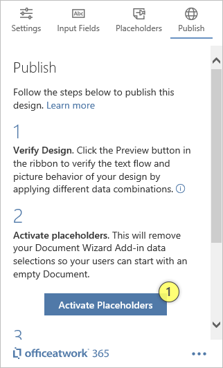
The publish page is split up into three steps «Verify Design», «Activate placeholders» and «Distribute Design».
This step is designed to guide you through the process of verifying your design and its behavior by simulating user input using the «Wizard» Add-In. To launch the «Wizard» Add-In just click on the «Preview» icon in the Word Ribbon within the «Designer» Add-In ribbon group. If you want to simulate a user that has never used the Wizard, you can use the 'Clear Last Input Cache' button to clear data that would, for instance, influence the 'Remember last selection' for any given Input field. etc.
Once you are finished with verifying the design you want to make sure that all your simulation data will be removed. To do this click on the «Initialize Placeholders» (1) button. This will clear all of your simulation data and will reveal the placeholder text defined for each of your «Placeholders».
Congratulations, once you are finished with verifying the design and you have removed the simulation data created with the Wizard Add-In using the «Activate Placeholders» button, you are ready to save and distribute your template as you require. Please consider using the officeatwork «Template Chooser» Add-In as the ideal solution to promote you templates within your organization.
Please note:
Please be sure to not rename or remove any contents you have linked in your templates as users will be seeing an error message for contents that can not be found when user create documents from your template (and run the Wizard for the first time with that newly created document). To check if your contents are still available and up-to-date you can run the Verifier.
You might want this app to open alongside your document automatically. To actively embed the Add-In into your currently open document, please follow the steps below:
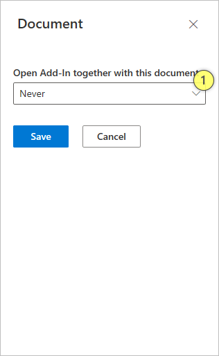
Open the Add-In 'Settings' menu.
Click on the 'Document' option.
On the 'Document' pane, choose your Embedding option (1).
Click 'Save' to save your changes.
Attention:
Please be aware that automatically launching an app, together with a document, will only work if:
The user opening the document, with the embedded app, has the app available already, and,
The Add-In deployment method is the same for both the user who embedded app and the user opening the document, with the embedded app.
For example, if one user acquired the app from the Office Store, and the other user acquired the app via centralized deployment, the embedding will not work for both users. It will only work for the user who embedded the app in the document. To avoid this platform limitation, please ensure that all your users in your organization acquire the app using the same deployment method, preferably using centralized deployment.
Choose this option if you do not want the Add-In to open together with your document (default setting).
Choose this option if you want the Add-In to only open the next time you open your document, after that it shall not open automatically anymore.
Choose this option if you want to have the Add-In open together with your document all the time. Note that the Add-In will also open if you close your document with the Add-In closed and then re-open the document.